
Many restaurants struggle with attracting and keeping customers. A bad color scheme or outdated design can make customers leave before they even order. Colors affect how people feel, their appetite, and even how food tastes. If the colors are off or don’t match, it can send the wrong message, and customers may not come back. The solution is understanding how color works in restaurants. With the right colors, you can improve the atmosphere and overall experience for your customers. Using color effectively can make your restaurant more comfortable, strengthen your brand, and increase enjoyment for diners. At Best Service UAE, we specialize in color consultations, helping restaurants create the perfect design that customers love.
Why Restaurant Color Psychology Should Never Be Ignored
Every color elicits a distinct feeling and bodily reaction. Colors can generate energy, soothe anxiety, or increase hunger. The importance of restaurant color psychology to success stems from this. When color is used well, it creates a welcoming and calm atmosphere. Ineffective use makes them leave without saying anything. Customers’ spending and length of stay are directly impacted by color. Even before the food is served, it creates first impressions. Astute diners clearly benefit from this science. It’s critical for owners to comprehend how colors impact behavior.
Warm Colors Make People Hungry and Comfortable
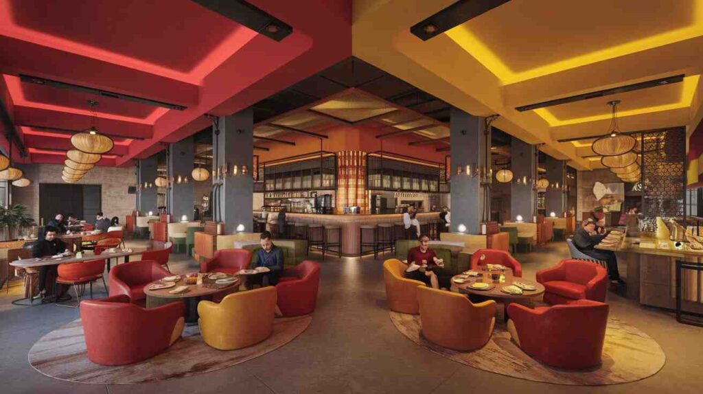
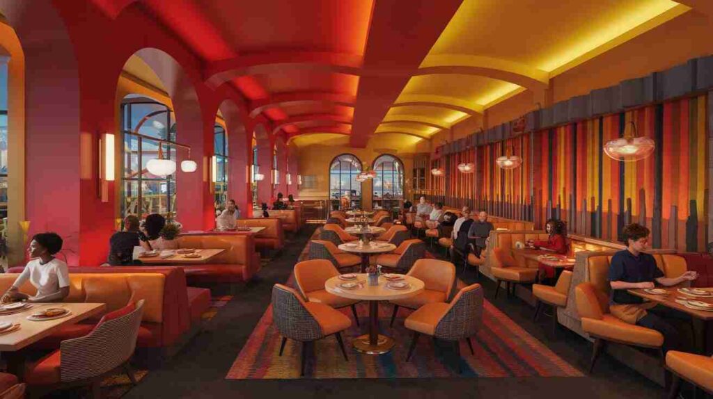
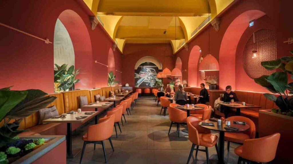
Warm hues like orange, yellow, and red pique people’s appetites quickly. Around the world, fast-food branding frequently uses these colors. They raise energy levels, heart rates, and even the volume of discussion. Restaurant Color Psychology states that warm colors induce speedy dining. Red is particularly potent; it almost immediately piques appetite. Warmth, friendliness, and a convivial dining atmosphere are all enhanced by orange. In any environment, yellow adds vibrancy and attention. To prevent overpowering the room, use these colors sparingly. Warm accent trim for a wall or ceiling can work wonders.
Cool Colors Create Calm, Relaxed Dining Environments
The effects of cool hues like purple, green, and blue are the reverse. Blue reduces hunger but promotes calmer, longer stays indoors. Green represents nature, freshness, and dietary choices. Purple evokes robust flavor, inventiveness, and luxury. According to restaurant color psychology, cafés benefit from cold hues. They are ideal for both sophisticated lounges and laid-back bistros. Seafood cafes and related places look good with blue décor. Green is perfect for establishments that serve organic, vegan, or sustainable food. Purple can work well in fine dining establishments, wine bars, and dessert cafés.
Restaurant Color Psychology and Cultural Influence
Cultural and consumer expectations influence the meanings of color. In Asian tribes, for instance, red is not just associated with hunger but also with luck. Green can represent nature, fertility, or even spiritual purity in other cultures. In many cultures, purple is associated with riches and monarchy. In restaurant color psychology, it is essential to comprehend local culture. One group may find something welcoming, while another may find it cruel. Color psychology must strike a balance between visitor comfort and brand identification. Restaurants that serve customers from other countries need to research their color preferences. This guarantees a friendly, inclusive, and productive atmosphere for everyone.
Neutral Colors Add Sophistication and Flexibility
Not every wall needs to be flamboyant, noisy, or incredibly colorful. Neutral hues swiftly add harmony, nuance, and contemporary appeal. White, taupe, gray, and beige all produce elegant, serene environments. Additionally, they go nicely with striking decorations and chic lighting. Neutrals serve as a blank canvas in the field of restaurant color psychology. They naturally let the focus be on your cuisine and décor. In crowded dining rooms, neutrals assist lessen visual stress. They are perfect for upscale restaurants or minimalist cafés today. Add texture or artwork to keep the space from feeling cold.
How Lighting Enhances Restaurant Color Psychology
Paint colors and lighting combine to influence the experience. Warm hues are enhanced and meal turnover is increased by bright lighting. Cool hues appear deeper and more dramatic in dim light. Color perception quickly varies depending on the type of lighting. Dining establishment Additionally, the lighting design affects color psychology. In a dimly lit room, a brilliant red could appear orange. White may appear blue in fluorescent or LED lights. Top Service UAE provides knowledgeable guidance on paint and lighting combinations. When combined, they contribute to the development of visual harmony, identity, and mood.
Strategic Color Placement Matters in Restaurant Design
Everything changes depending on how color is used in a location. Perception is influenced by menus, dinnerware, walls, ceilings, and furniture. The placement of a restaurant’s brand color should be deliberate and subtle. Visually, accent walls behind bars or booths work really well. Balance and contrast are always crucial in restaurant color psychology. When one color is used excessively, it might cause visual strain or weariness. Instead, create dynamic contrast by combining cool and warm hues. To conceal wear, use deeper hues in areas with lots of traffic. In waiting rooms or dining areas, lighter hues look fantastic.
Restaurant Color Psychology: A Secret to More Revenue
The amount that customers purchase, spend, and tip is influenced by color. Red may be used by a fast-casual restaurant to speed up the dining experience. For longer stays, a posh lounge can go with gentle blue. Visual design and consumer behavior are linked by restaurant color psychology. The length of time visitors remain and return is influenced by smart colors. Stronger reviews and bigger orders are encouraged by the appropriate paint palette. Customers are happier in areas that appear intentional. Color is a marketing and sales technique in addition to being used as décor. Restaurants who repaint with Best Service UAE report major improvements.
Rebranding with Color: Give Your Restaurant New Life
Over time, restaurants that seem dated tend to lose patrons. A stale color palette can undermine the brand’s new image. Renaming with color and meaning is aided by restaurant color psychology. Younger or wealthier customers may be drawn to a new palette. It inspires your team, generates buzz, and revitalizes your image. Change and progress are immediately indicated by the appropriate colors. Color works for both dramatic vitality and laid-back elegance. Additionally, repainting is less expensive than complete remodeling. You can effortlessly update your space with Best Service UAE.
Best Paint Colors Based on Restaurant Type
Different color schemes are needed for different kinds of restaurants. The use of red, orange, or yellow motifs is advantageous for fast food brands. Warm accents and neutral walls are frequently combined in informal dining settings. Darker colors and shiny finishes are frequently used in upscale dining establishments. Pastel colors, light green, or earth tones are ideal for cafés. Dessert establishments can experiment with light blue, lavender, or pink hues. Deep maroon, navy, or black are frequently preferred colors for bars and lounges. Every style is guided toward suitable palettes by restaurant color psychology. Making the appropriate decision also improves brand consistency and guest comfort.
Mistakes to Avoid with Restaurant Colors
Don’t use too many colors that clash in one area. Red used overly might cause visual tension or anxiety. If used excessively on walls, blue might come across as chilly or unappetizing. Additionally, don’t overlook lighting while selecting paint colors. Avoid using colors that are too gaudy or transient since trends change. Timeless hues are preferred by restaurant color psychology over passing trends. Painting everything the same hue results in a flat, drab appearance. Instead, provide depth by utilizing texture, contrast, and balance. Top Service UAE makes it simple for eateries to steer clear of these expensive errors.
Final Thoughts on Restaurant Color Psychology
Before staff even greet customers, the color scheme of a restaurant speaks for itself. It evokes emotion, supports the cuisine, and establishes the mood. Restaurant color psychology contributes to the creation of profitable and memorable dining spaces. The correct color scheme rapidly improves mood, appetite, and brand identity. Color is important when renovating an existing space or launching a new one. A few well-chosen paint selections can quickly improve company performance. Let professionals like Best Service UAE help you choose the best color choices. Their background guarantees balance in terms of layout, lighting, and color. Select hues that will excite your guests and represent your brand.


